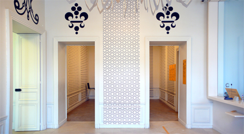
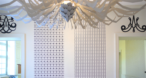
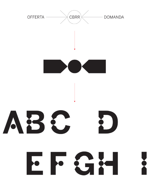
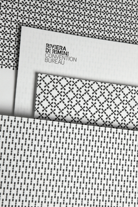
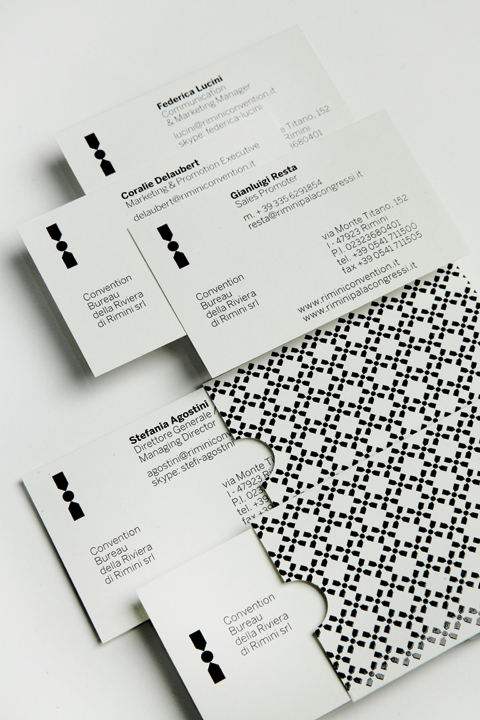
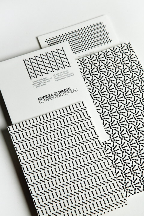
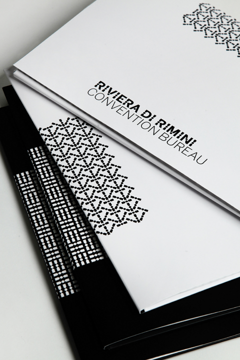
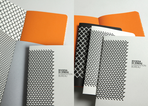
The new visual identity for Convention Bureau della Riviera di Rimini has been curated by Tassinari/Vetta studio (design by Leonardo Sonnoli and Irene Bacchi).
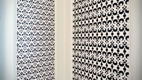
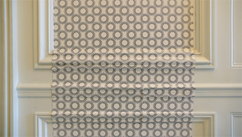
The basic idea translates visually the fundamental function of a Convention Bureau: to put in connection supply and demand for the meeting industry. Based on this concept, the logo and the custom font called “Riviera” come out.

Leonardo Sonnoli and Irene Bacchi designed a series of 4 posters as part of the set up for the performance “Everydayjohncage Live”, produced by the Municipality of Rimini.
The four letters -C, A, G, E- are the result of 4 sessions throwing an octahedron dice. Then each letter is composed in a random way, with a predeterminate drawing, from the eight symbols corresponding to the eight side of the dice.

A project by Andrea Felli, Roberto Paci Dalò, Leonardo Sonnoli.
Rimini, from 1 January to 31 December 2012, one year dedicated to John Cage.
Every day a virus distributes through the city, in public and private places, fragments and materials related to John Cage.
Designed by Leonardo Sonnoli and Irene Bacchi.

The logotype is designed to assume always a different shape/size randomly, throwing one dice.
The 16 letters are positioned in a 4×4 grid and fixed the smaller size it is multiplied by the result of a dice throw.

Here few pictures of the north wing at the Château de Versailles (see the previous post).
The decoration of these reception spaces for groups and students has been designed by Leonardo Sonnoli with Irene Bacchi.

In the year 2009 Jean-Jacques Aillagon, the president of the Château de Versailles, got started the project to renovate the rooms of the two, so called, Ailes des Ministres (north and south). The new spaces were designed as reception of the visitors (the south wing) and of the groups and students (the north wing).
Leonardo Sonnoli was asked to design a visual entertainment. Now, after two years and three different projects, the work made with Irene Bacchi is arrived at the end.
The installation tells the history of the castle through the interpretation of its icons:
the kings’ portraits, from Louis XIII to Louis Philippe, the queens, the typography -the famous Roman du Roi and its dveloping- and the symbols of the power, the costumes of court and the paintings collected by Louis XIV.
The work is painted on the wall or put on with wallpapers: both are quotations of the frescos and wallpapers decorating the famous rooms of the Versailles palace.
Here few pictures of the south wing. In a next post the pictures of the north wing.

From the 18th od November 2011, at the Biblioteca Gambalunga in Rimini, three artist show an installation as dialogue between their works and the antique books of the library. The venue is the library’s antique rooms. Leonardo Sonnoli with Irene Bacchi designed an extremely low budget catalogue collecting in a numbered (300 copies) black box all the 60 unbounded pages with textes and pictures of the exhibition. The old archive style box is filled with an interpretation of the fragility of our digital library by Sonnoli and Bacchi: a glued 3.5″ floppy disk on the back of its xerox portrait. The boxes walls installed in the rooms is designed to be removed by the visitors.

Leonardo Sonnoli with Irene Bacchi designed pro bono a collection
of T-shirts and bags to be printed at the silkscreen workshop
of the Venice male prison, run by the inmates.
Here the first 5 printed subjects on sale through: info@riotera-ve.it

bacchi – dilitta – macchia – sonnoli
for spaghetti – vespa – typography exhibition

From the 27th of June to the 15th of July the Faculty of Architecture
of the University Iuav of Venice organized the 10th edition of the Workshop
of Architecture of Venice -known as W.A.Ve.-.
Leonardo Sonnoli and Irene Bacchi designed its visual identity: from the
communication through posters, advertising on buses and boats,
to the notebooks and bags and the temporary signages and warning signs.
The identity uses a system with a logotype and a moving pattern made
with the wings sculpture in front of the Iuav building
(designed by Massimo Scolari) duplicated in different sizes
to suggest a perspective.