By admin

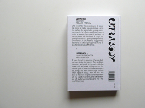
When Montag met Clarisse…

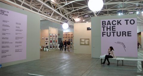
On the 23rd of March 2013 Leonardo Sonnoli has been invited to talk at “Fruit” in Bologna, an art micro-publishers, self-publishers, printers, graphic designers, illustrators and artists exhibition.
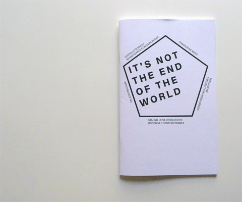
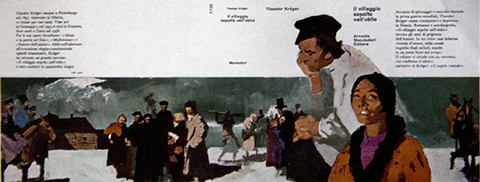
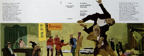
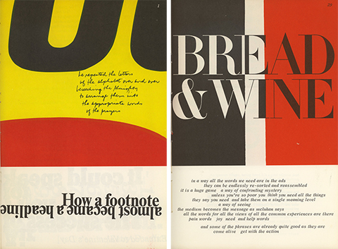
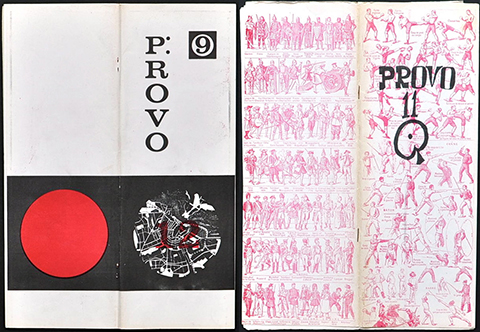
His talk was about the wrong idea to consider “indipendent” the little publishers. He invited in his talk two young researcher, Irene Bacchi and Niccolò Mazzoni, to demonstrate that the history teach us to develop our future. The two designers –contemporary Montag and Clarisse (see “Fahrenheit 451)”– talked about two italian publishing houses of the past, Il Saggiatore and La Nuova Foglio. Sonnoli discussed on independency and experimental publishing through few examples by Sister Corita, the Provo group, Pieter Brattinga and more.

The Nuova Consonanza association organized a series of events at the American Academy in the beautiful Villa Aurelia of Rome, to celebrate the 100th anniversary of John Cage.
From the 18th of November to the 14th of Dicember 2012 within the “Festa d’autunno 2012 – CentoCage” event,
Irene Bacchi, Nicholas Blechman and Leonardo Sonnoli contributed with the installation “Heidelberg Speedmaster”, a series of three posters and a video that filmed the process of posters print in three times, based on the 4′33″ of John Cage. The posters were available to pick up to leave the floor “silent”.

more info www.nuovaconsonanza.it

Since 9th of November the new website of Internoitaliano is on line (www.internoitaliano.com). It is a new system for the production and sale of designer furnishings, created by Giulio Iacchetti, that brings Contemporary Italian Design with the quality of traditional Italian craftsmanship to the worldwide marketplace with products sold exclusively online.
Leonardo Sonnoli with Irene Bacchi (Tassinari/Vetta) designed the identity of Internoitaliano, the website, and the catalogue.
The catalogue/folders holds the contribution of Beppe Finessi and Stefano Micelli that wrote two “Manifestos” for Internoitaliano, Guido Guidi who gave a photographic sequence of an italian domestic space and Max Rommell provided the craftsmen’s photos.

From the 9th to 11th of November in Turin took place the successful edition of Artissima 2012, International Fair of Contemporary Art, directed by Sarah Cosulich Canarutto.
Leonardo Sonnoli with Irene Bacchi, Igor Bevilacqua and Anny Comello at Tassinari/Vetta studio designed the identity of the fair, the catalogue and the signage.

ARTISSIMA – Fair of Contemporary Art – opening on 8th of November in Turin.
Designed by Leonardo Sonnoli with Irene Bacchi, Igor Bevilacqua, Anny Comello at Tassinari/Vetta.


The Faculty of Architecture of the University Iuav of Venice organized the 11th edition of the Workshop of Architecture of Venice -known as W.A.Ve.-. (July 2nd-20th 2012)
Leonardo Sonnoli with Irene Bacchi updated its visual identity and the temporary signages and warning signs.
Besides the logotype the moving pattern -made with the wings sculpture in front of the Iuav building (designed by Massimo Scolari)- suggest a 3dimensional architectonical space.
As in the previous editions of Wave the design is inspired by the visual research of the italian graphic designer Franco Grignani.

PCI poster selected for
23ᵉ Festival International de l’Affiche et du Graphisme de Chaumont

Works from art and design are showed in Milan in the exhibition “Ultrabody” curated by Beppe Finessi. An unusual and inspiring collection of objects connected to the human body.
The catalogue is designed at the studio Tassinari/Vetta by Leonardo Sonnoli with Irene Bacchi, as well as the exhibition graphics and communication.

Ultrabody
cm 17 x 24, hardback, 256 pages.
English and Italian texts.

Giulio Iacchetti, one of the most prominent italian designer of the new generation, designed for the Abet Laminati a collection of digital printing laminates.
The “Parade” collection has been exhibited at the Triennale di Milano during the Salone del Mobile 2012.
At the Tassinari/Vetta office, Leonardo Sonnoli with Irene Bacchi designed the catalogue/notebook, a series of four posters, the graphics for the exhibition and the
swatch samples.
The Parade logotype letters come from the tipical shape of the samples.